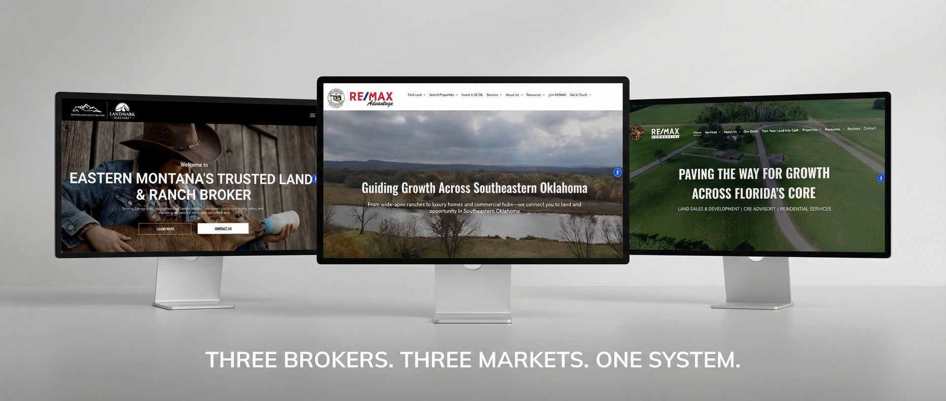
Over the past year, we've built and redesigned websites for land brokers across the country. Different markets, different specialties, different experience levels—but the same patterns kept showing up.
Here's what we learned about what works, what doesn't, and why most land broker websites fail before they even launch.
Most Brokers Start With the Wrong Question
When brokers come to us, the first thing they usually say is: "I need a new website." Then they start talking about colors, logos, and whether they want a slider on the homepage.
None of that matters yet.
The right first question is: What do you want this website to do? Generate listing leads? Attract buyers? Establish credibility for listing appointments? Serve as a portfolio for your track record?
A website built to generate buyer leads looks different than one built to win listing appointments. A site for a broker who specializes in ranches looks different than one for someone selling recreational tracts. The strategy has to come before the design.
Every successful site we've built started with that conversation—not with font choices.
The "About Me" Problem
Almost every broker website puts too much emphasis on the broker and not enough on the visitor.
We get it. You're proud of your experience. You want people to know you're credentialed, that you've closed deals, that you know the market. That's all relevant. But it's not what visitors care about first.
When someone lands on your site, they're asking one question: Can this person help me with my specific situation?
The sites that convert answer that question immediately. They speak to the visitor's problem before they talk about the broker's resume. They say "If you're looking to sell land in [county], here's how we help" before they say "I've been in real estate for 20 years."
Your credentials matter. But they matter more after you've established relevance.
Listings Alone Aren't Enough
Some brokers think their website just needs to display their current listings. That's the whole site—a glorified MLS feed.
Here's the problem: listings are temporary. When a property sells, that page is gone. If all your traffic is going to listing pages, you're on a treadmill—constantly needing new inventory just to have something for people to look at.
The sites that build long-term value have evergreen content. Market information for the areas you serve. Guides that help buyers understand the process. Resources that position you as the expert. This content keeps working for you even when your inventory is thin.
A listing-only site is a brochure with an expiration date. A content-rich site is an asset that compounds.
Mobile Isn't Optional
This seems obvious, but we still see it constantly: broker websites that look fine on a desktop and fall apart on a phone.
More than half of your traffic is coming from mobile devices. Buyers searching for land on their lunch break. Sellers looking you up after a referral. People clicking through from your social media posts—which they're viewing on their phones.
If your site is hard to navigate on mobile, if the text is too small, if the buttons are hard to tap—you're losing people before they ever see what you offer.
Every site we build is mobile-first. Not mobile-compatible. Mobile-first. The phone experience gets designed before the desktop experience, because that's where most of your visitors are.
Speed Kills (or Saves) You
A site that takes more than three seconds to load loses half its visitors. That's not an exaggeration—it's data.
Most broker websites are slow because they're bloated. Massive image files. Plugins that were installed three years ago and never removed. Themes with features nobody uses but everyone's paying for in load time.
The fastest sites are the simplest. Optimized images. Clean code. No unnecessary scripts. It's not about having less—it's about not carrying dead weight.
When we take over a site redesign, the first thing we do is audit what's slowing it down. Sometimes the fix isn't a redesign at all—it's just cleaning up the mess.
The Broker Is Part of the Brand
Here's something that surprised us: the sites that perform best almost always feature the broker prominently.
Not in a vanity way—in an authenticity way.
People want to know who they're working with. They want to see your face, hear your voice, understand your approach. A site that feels like a faceless company doesn't build the same trust as one that feels like a person you could actually call.
This is especially true in land brokerage, where relationships matter more than transactions.
Buyers and sellers want to work with someone they trust, not a brand. Your site should feel like you.
What We Build Now
After all these projects, we've developed a clear point of view on what a land broker website should be:
It should answer the visitor's question before talking about the broker. It should work flawlessly on mobile. It should load fast. It should have content that lasts beyond current listings. And it should feel like a real person—because that's who buyers and sellers want to work with.
That's the standard. That's what works.
Landverse AI builds websites specifically for land brokers—designed around what actually converts, not what looks good in a template. See examples at landverseai.com/websites.